THE "GRECS DU ROI"-TYPES
EUSEBIUS et al.
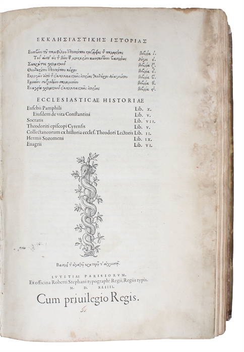
Ekklesiastikes Istorias (Greek)... Ecclesiasticae Hisoriae. Eusebii Pamphilii Eiusdem de vita ConstantiniSocratisThedoriti episcopi CurensisCollectaneorum ex historia eccles. Thodori LectorisHermii SozomeniEuagrii
Paris, Stephanus (Estienne), 1544.
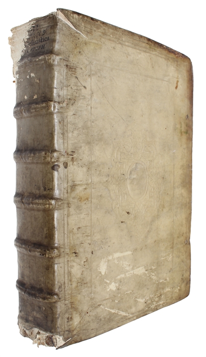
Folio. Contemporary full vellum with some wear. Six raised bands to spine and large blindstamped centrepieces to boards. Capitals and upper part of back board worn and torn; but binding still fine and solid. Some dampstaining, especially to beginning and end, though mostly marginal. Back end-paprs quite dampstained. A worn, but still nice copy with mostly bright and clean pages. Bookplate to inside of front board and old owner's inscriptions and a pasted-in catalogue-description to front free end-paper. Numerous large foliated and grotesque initials and headpieces and large woodcut printer's device on title-page (basilisk) and verso of final leaf (the so-called device 10) . (4), 361 (misnumbered as 353, and including blank P5), 181, (5) ff.
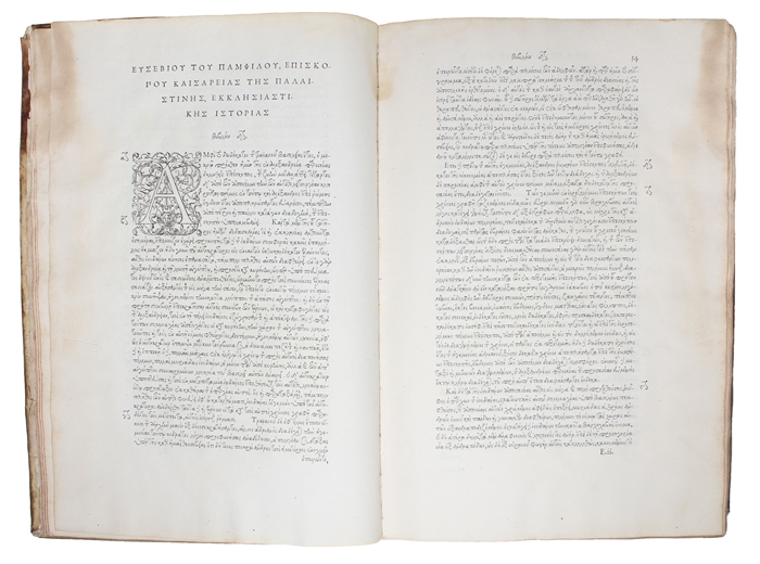
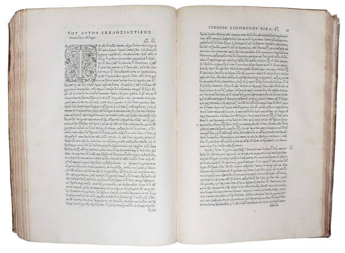
The rare editio princeps of one of the most beautiful and elegant of all renaissance printings, namely Estienne's magnificent volume of "Church History", which constitutes the first major Greek text produced by Estienne as the King's Printer in Greek and the work which marks the first appearance of a full text in the fist font of the Royal Greek types (the so-called "grecs du roi") - "These cursive Greek types are universally acknowledged as the finest ever cut." (Schreiber). This is also the first book in which appear the splendid matching initials and headpieces, which are considered "among the best of the printed decorations used in the sixteenth century" (Updike).
In 1542, Francois I appointed Estienne his new printer in Greek, and at the same time he commissioned Claude Garamond to cut a new Greek font intended specifically to be used to print Greek books from then unpublished manuscripts in the Royal Library at Fontainebleu. The first text selected for printing by Estienne was the great "Ecclesistical History", which marks a new era of book printing. Garamont's new Royal Greek types, the later so famous "grecs du Roi", used for it, were based on the handwriting of the Cretan Angelo Vergezio's (a well-known calligrapher), with its many ligatures; the capitals were influenced by roman letters that Garamont had already cut. One of the particularities of these fonts was the introduction of accents and breathing marks, made with the use of kerned letters. Garamont's skill can clearly be seen in the ligatures and the treatment of the abbreviations.
The work is very difficult to find complete.
Schreiber: 77.
Order-nr.: 53839


